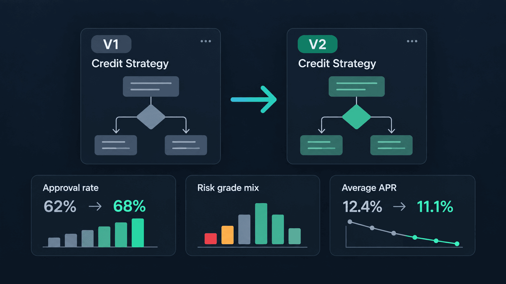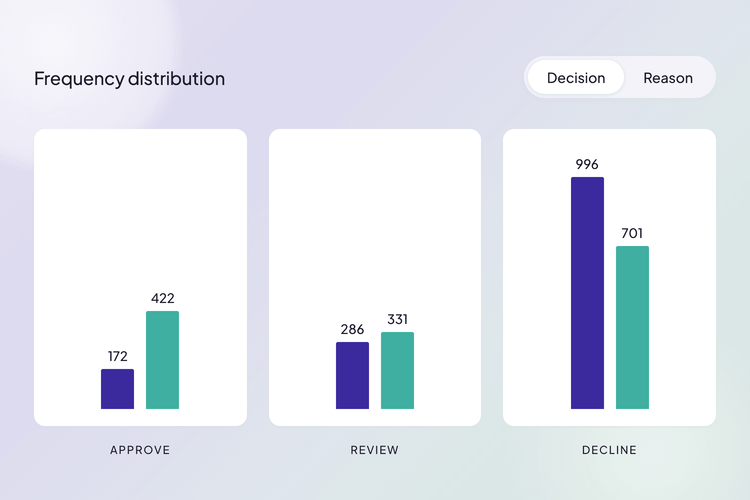
Key Takeaway
See the Consequences Before You Ship
A candidate policy can run alongside production on the same traffic, logging what it would have decided without touching a customer. You see the effect on the whole portfolio before you commit, not a quarter later.
Evidence, Not Seniority
Every execution can be recorded as it happens, so there is no warehouse to build and no analyst queue to join. The decisions your rules already made are the data, so policy arguments get answered with what happened rather than with opinion.
Improvement Is a Loop, Not a Project
Changing the logic is an edit, not a release cycle, and whatever you ship can record from its first run. The next question already has its evidence waiting, and the same loop is ready for the one after it.
Every chart in this article is drawn from a sample dataset built for the demo, not a live loan book. The mechanics are the product. The numbers are here to show the shape of the change.
The Argument, Settled
Every lender has this meeting. Growth says the approval bar is too high and the book is turning away business it could safely write. Risk says prove it. Then nothing happens for a quarter, because proving it means a data extract, an analyst, a model rebuild, and a queue.
The demo on our Decision Intelligence page is that argument, settled.
Lending is the example, not the point. Any decision with a threshold in it has this shape: a discount tier, a fraud score, a claims routing rule, an eligibility check, a pricing band. Swap in your own domain and the mechanics underneath are identical.
The demo makes that case in milliseconds. Here is what runs underneath it.
Follow One Decision
Before we open up any single part, here is the whole path a loan takes, and it runs the same way every time.
An application arrives: a few facts about a borrower. The rule reads them and hands back a decision along with the amount. That decision is not returned and forgotten. The moment it is made, the whole thing is written down: what came in, what went out, which version of the policy answered, and when. Every request, every time.
That record is what turns a stack of one-off decisions into something you can learn from. The Statistics page reads those records back and draws them, so you can see how the decisions split, how the money moved, and what changed when the policy changed.
That is the loop, and it is the whole idea behind Decision Intelligence: decide → record → analyze → improve, and around again. And you don't have to try one version at a time. Several candidate policies can score the same applications in parallel, each logging what it would have done, so you can weigh them against each other before committing to any.
This same execution data provides the foundation for continuous credit risk monitoring.
The rest of this article follows one trip around it, starting with the rule itself.
What Runs When You Move a Slider
The whole project has five rules. That is the entire lending logic: nothing hidden in an application, nothing in a stored procedure, nothing in a spreadsheet on somebody's laptop.
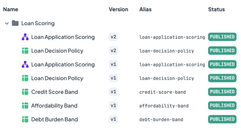
The entire lending logic in one folder. Two of the five rules carry a second version.
Between the two, a Decision Flow runs five steps.
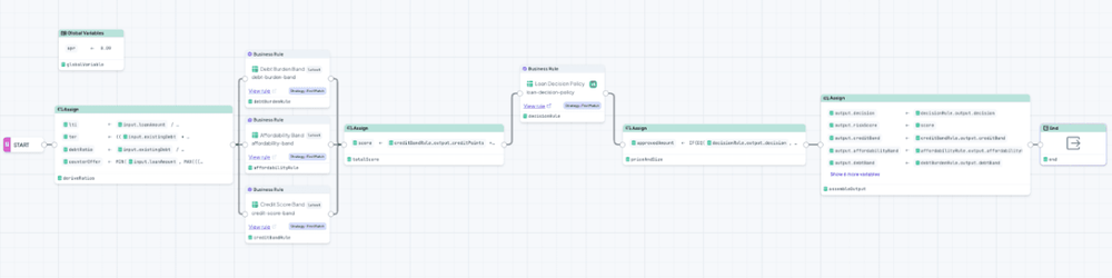
The flow in full. Three band rules run side by side, feed one score, and the policy table decides.
- Derive the ratios. A €210,000 loan means nothing on its own. Against €120,000 of income it is a loan-to-income ratio of 1.75. The flow also works out the largest loan that would still fit inside the affordability cap, which becomes the counter-offer later.
- Score three dimensions. Three Decision Tables each look at one thing and award points: credit history, affordability, and existing debt burden. Each is a small grid a credit officer can read out loud. The affordability table also raises a hard fail if the applicant is over-leveraged, which is a veto rather than a deduction.
- Add it up. The three tables produce a risk score from 0 to 100. Every applicant gets one.
- Apply the policy. A fourth table takes the score and the hard fail flag and returns the decision. This is the one that matters for this article, so here it is in full.
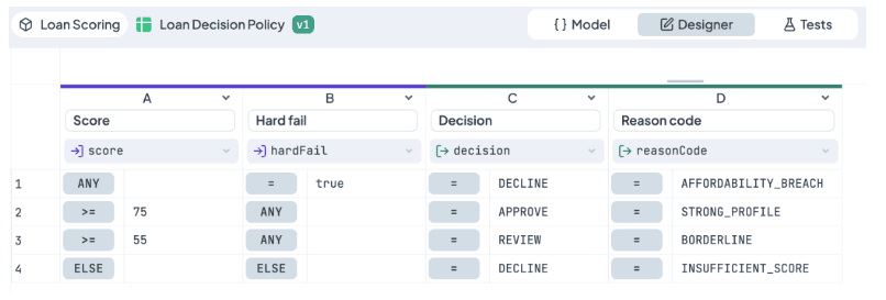
Version 1. Four rows, two input columns, two output columns.
Row one is the veto: hard fail, decline, reason AFFORDABILITY_BREACH. Row two approves anything scoring 75 or above. Row three sends 55 to 74 for manual review. Row four declines the rest. Four rows, and every one is a sentence a business person would say out loud.
5. Price and size of the offer. APPROVE gets the amount requested, DECLINE gets zero, and REVIEW goes to a person with a suggested amount that never exceeds what the applicant can afford. The monthly payment is calculated at the current APR, held in one place so a rate change is one edit.
That is the whole rule. We covered credit scorecard design and affordability, pricing, and APR in one flow in depth elsewhere. For this article, everything above is context. The interesting part is what happens when one of those four rows changes.
Change the Policy, Keep the Evidence
Back to the meeting. The growth side wants a lower bar. So we lowered it.
APPROVE moved from 75 to 60. REVIEW moved from 55 to 42.
That is the change. Two numbers. Same four rows, same columns, same reason codes, same veto sitting untouched in row one.
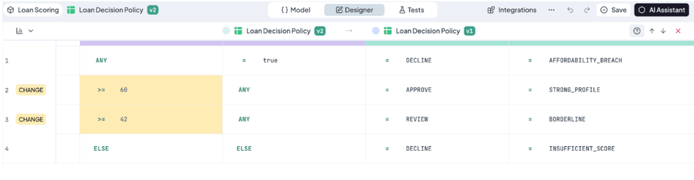
The diff. Two rows marked as changed, two cells highlighted, everything else identical.
Here is what matters more than the edit itself: version 1 did not go anywhere.
Before making the change, a new version was created, so the edit landed on version 2. The old table is still there, still readable, still running, and still attached to every decision it ever made. If a regulator asks in eighteen months why an applicant was declined last May, the answer is not a reconstruction from memory or a git blame on a config file. The exact table that made the call still exists, and so does the log of the call.
Why the old version keeps running
If version 2 is the improvement, why is version 1 still executing and still filling the logs?
Because you chose to keep it there. You could point production at "latest version" and let every new version take over automatically. Here you deliberately don't: you pin production to version 1 and keep it in charge so the change stays under your control until you have seen what version 2 actually does. Version 2 runs alongside on the same applications and quietly logs what it would have decided. No customer sees it, no money moves because of it. This is A/B testing in credit risk, run on the live population without exposing it.
Then you compare the two logs. If version 2 holds up, you switch and version 1 stops. If it does not, you found out for the price of some storage rather than a quarter of bad loans.
One difference, on purpose
There is a version 1 and a version 2 of the flow as well. If you put them side by side, you would find exactly one difference: the node that calls the policy is pinned to policy v1 in one, and to policy v2 in the other.
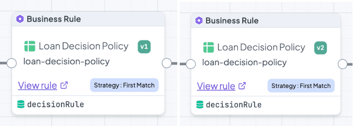
One variable. Same alias, same strategy, same output name, different pinned version.
Everything else is shared. Same ratios, same three scoring tables…
That is deliberate, and it is the difference between a demo and an experiment. When the same applications go through both flows and the charts diverge, there is exactly one candidate explanation, because there is exactly one difference. Nobody in the room gets to argue that the credit bands drifted or that somebody quietly changed the pricing in between.
What Statistics Showed Us
Everything from here comes out of one place: the logs.
Every run leaves a record
When a rule runs with logging on, DecisionRules keeps the whole thing. The full input that arrived, the full output that went back, which version answered, and when. Not a counter, not a sample. The record.
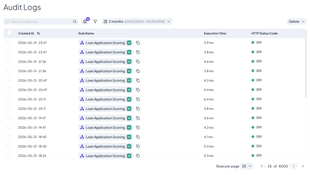
Each application logged twice, once per version, at the same instant.
That is the raw material. Statistics does not need a warehouse, an ETL job, or a ticket to an analytics team. It reads the logs you already have.
Three choices
Analysing a rule comes down to three questions: which rule, which window, and which field.
The first two are pickers. The third is the Data Dictionary, and it is worth a minute because of where it comes from. Nobody declares it and nobody maintains it. It is assembled from the logs themselves, so it lists the fields that genuinely appeared in real executions, sorted into three scopes:
- Inputs: the data that arrived with each call
- Outputs: what the rule sent back
- Metadata: the technical facts of the execution: version, status, timestamp, execution time, and so on…
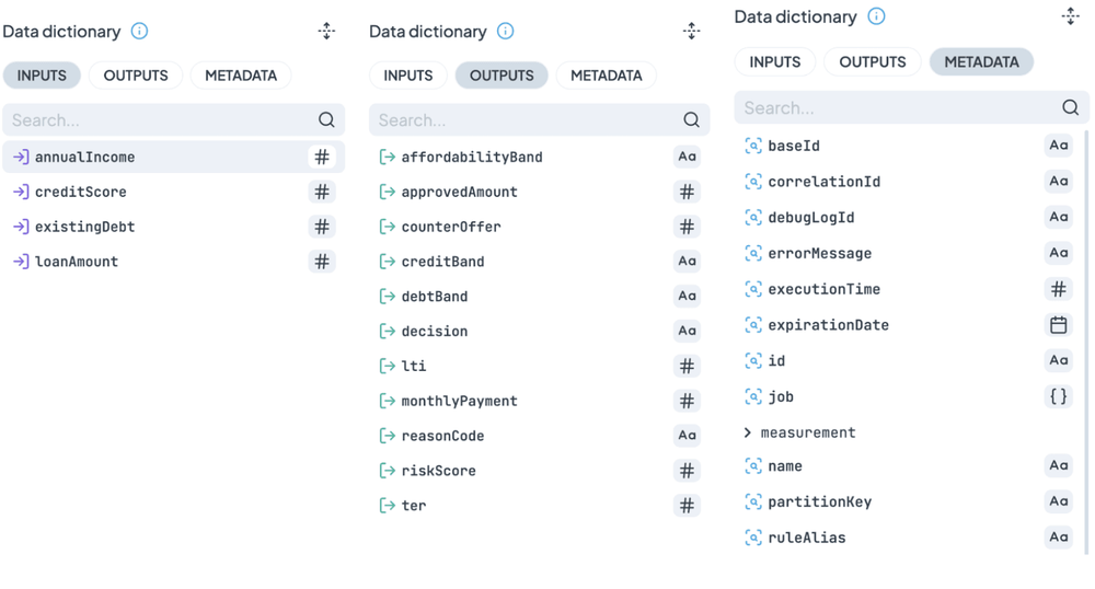
Nobody wrote this list. It is assembled from what the rule actually returned.
The practical consequence: the dictionary describes what your rule actually did, not what a schema says it should do. If a field quietly stopped being produced three weeks ago, it will not be in the list, and that absence is itself worth knowing.
For this rule, Outputs hold the eleven fields the flow assembles. The demo page charts two of them, decision and approvedAmount, because those are the two the business argues about. The other nine are sitting in the same logs, one click away, which is how you answer the follow-up question rather than the first one.
Comparison works two ways
Turn the comparison switch on, pick a second rule, and every chart draws twice. There are two situations where you would do that, and they answer different questions.
Both versions, same days. This is the parallel run described above. Version 1 serves production, version 2 logs alongside, and both cover the same applications over the same period. The question is: would the new policy have decided differently on the same people? Because the population is literally identical, any gap between the lines is the policy and nothing else.
Old version before, new version after. Once you switch, version 1 stops and version 2 takes over, so the two never appear on the same day. You compare across periods instead. On the chart bellow, the primary side reads April, when version 1 was still in charge and logged 1,992 decisions on its own. The comparison side reads May, when version 2 had taken over and logged 2,008. Two windows, two versions, one chart, no overlap anywhere.
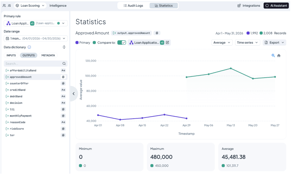
Two windows, two versions, one chart. The lines never share a day.
That works because each side of the comparison carries its own date range. The question it answers is different from the parallel run. Not would the new policy decide differently, but now that it is live, is it behaving the way the test said it would? This is the comparison most teams actually run, because it is the one that tells you whether the promise survived contact with production.
You can see the moment it arrived
Here is what a parallel run looks like when you widen the window far enough to catch the start of it.
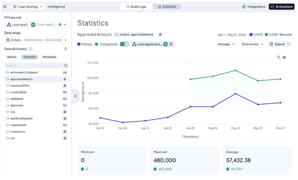
Nobody annotated this. The green line begins where the second version does.
Version 1 had been running since the start of April. At the end of the month we introduced version 2 alongside it, and from that day both were logging.
Nobody annotated that chart. There is no deployment marker, no release note pinned to the axis, no analyst adding context after the fact. The green line simply begins where the second version does, because the logs know when it started and the chart draws what the logs say. The gap between the lines opens immediately and never closes.
That is what "audit every decision" buys you. The history of your logic is not a document somebody has to remember to update. It is in the data.
The decision mix, and why the reason matters more
Now narrow the window to May, so both versions cover exactly the same days and the same applications each.
decision is a text field, so Statistics counts it. Three values, three bars, drawn twice.
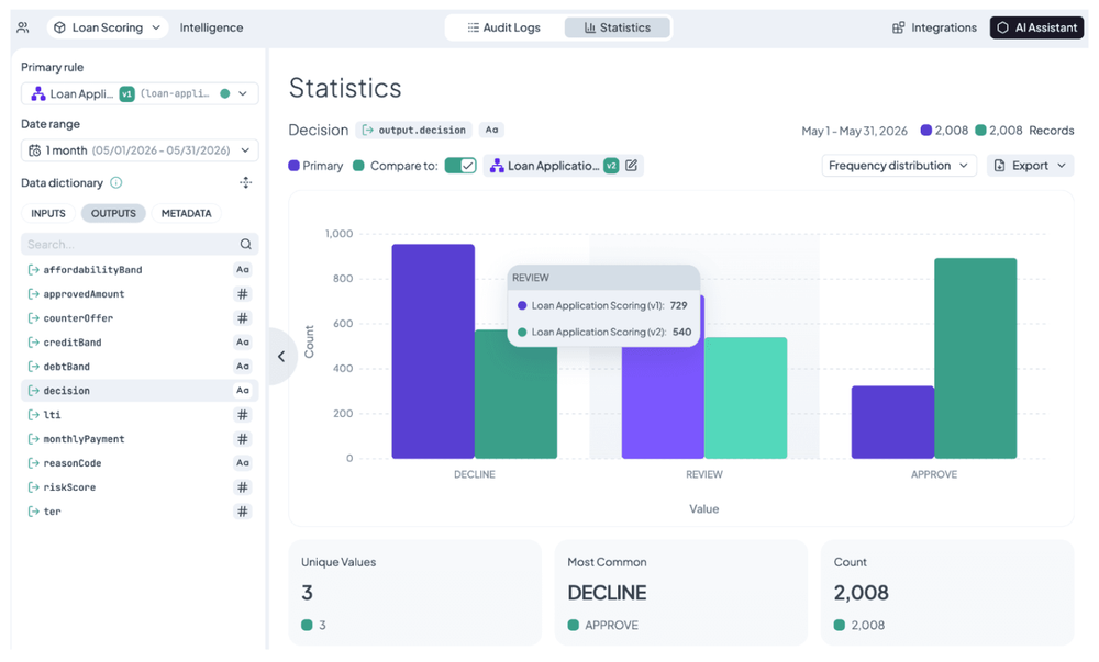
Same applications, same scores. Only the lines drawn through them moved.
- DECLINE [955] → [575]
- REVIEW [729] → [540]
- APPROVE [324] → [893]
Same applications. Same scores, because nothing that produces a score changed. Only the lines drawn through them moved, and the portfolio reorganised itself around the new lines.
The REVIEW column is the one nobody predicts. Dropping the APPROVE bar from 75 to 60 did not only convert declines into approvals. It pulled a slice of the old review queue into straight-through approval, which is manual underwriting cost coming off the desk rather than volume going onto the book. That benefit would never show up in a model backtest that only looked at good loans and bad loans.
Now switch the same chart to reasonCode. This is the more important chart, and it is worth being clear about why.
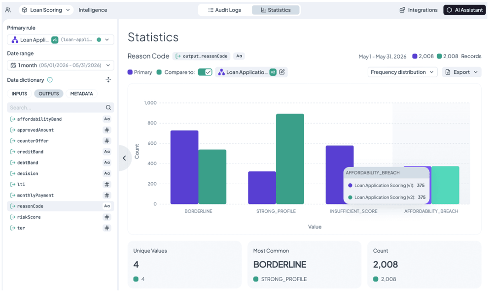
The finding. Insufficient score fell, affordability breach did not move at all.
decision tells you what happened. Three values: approve, review, decline. It is the action, the thing the applicant experiences, the number that goes in the volume report.
reasonCode tells you which row fired. And that matters because two applicants can both receive DECLINE for reasons that have nothing to do with each other:
-
INSUFFICIENT_SCOREmeans they did not clear the bar. That is a business judgement, and it is negotiable. Lower the bar and this person becomes a customer. -
AFFORDABILITY_BREACHmeans they cannot afford the loan. That is not a judgement, it is a limit. No threshold change should ever turn this person into a customer.
Same word on the decision. Opposite meaning underneath.
Look at what the reason chart adds. BORDERLINE tracks REVIEW exactly, 729 to 540. STRONG_PROFILE tracks APPROVE exactly, 324 to 893. Three of the four reasons tell you nothing the decision chart did not already say. The whole value of this chart is in the fourth: it splits DECLINE into the two reasons that have nothing to do with each other.
And the split is the finding. INSUFFICIENT_SCORE fell from 580 to 200. AFFORDABILITY_BREACH went from 375 to 375. Not close. Not approximately. The same 375 people were refused for the same reason under both policies, because the veto is row one of the table and the thresholds are rows two and three.
That is the safety argument in one number. Relaxing appetite is a business decision. Lending to someone who demonstrably cannot repay is a compliance problem. They are different things, so they live in different rows, and moving one cannot move the other. Had AFFORDABILITY_BREACH fallen alongside INSUFFICIENT_SCORE, you would have quietly started lending to people who cannot repay, and the decision chart would have looked identical either way.
If there is one design lesson in this project, it is that. Put the negotiable and the non-negotiable in separate rows, and you can move fast on one without ever risking the other. Then check the reason chart, because that is where you find out whether you did.
The money
approvedAmount is a number, so Statistics plots it over time instead of counting it.
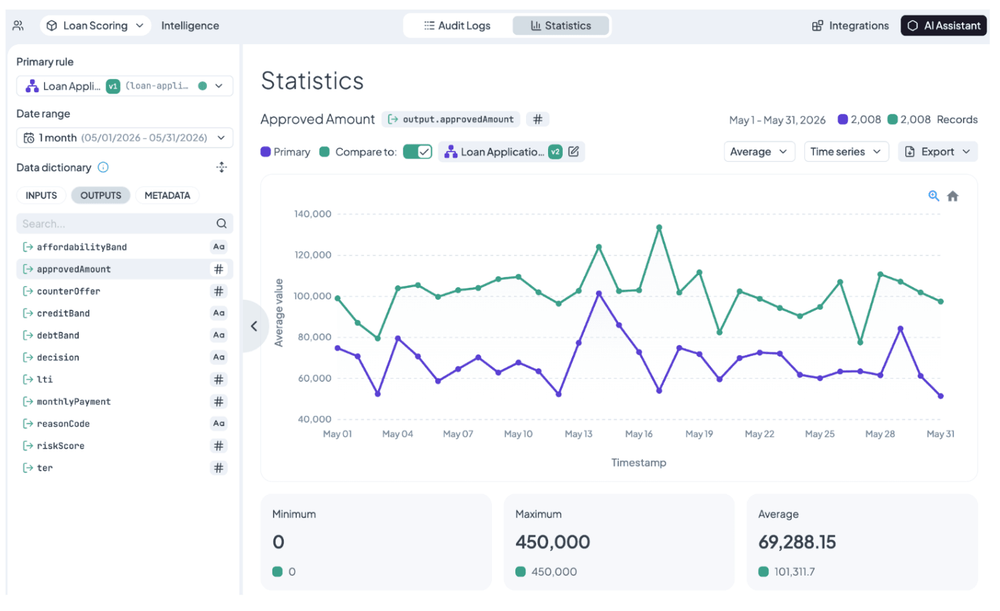
The average rose by nearly half. The floor and the ceiling did not move.
Look at the window on this chart against the earlier one, where version 2 first appeared. That chart spans April and May, and version 1's average across it is €57,432, dragged down by a month in which version 2 did not exist at all. Narrow to May, where both versions covered the same days, and version 1's average is €69,288.
Same rule, same logs, different number, and neither is wrong. That is worth internalising: the date range is part of the measurement. If you are comparing two things, make sure the window is fair to both, or you are measuring the calendar rather than the change.
The figures that did not move are as informative as the one that did. The average rose by nearly half. The minimum stayed at zero, so both versions still decline the worst applicants outright. The maximum stayed at €450,000, so neither version writes a loan bigger than the applicant asked for.
The bank did not raise its ceiling or lower its floor. It moved its middle. That is the fingerprint of a threshold change. If the maximum had moved instead, you would know somebody had touched pricing rather than policy.
One more control on the same chart: switch the metric from average to sum. Averages describe the applicant, sums describe the book. Same field, same logs, two different meetings. The credit officer wants the average. The CFO wants the sum.
And the fact that the two lines run parallel day after day rather than crossing and re-crossing is itself the finding. A systematic gap means a systematic cause. A handful of lucky applications would look like noise.
The whole record, not one field
Every chart so far answers a question about one field. Sooner or later somebody stops trusting the aggregate and says: show me one.
The Raw Data Table is not tied to a field. It shows the records.
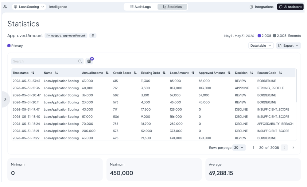
One row per decision. The charts are the argument, this is the evidence.
This is where the sliders at the top of the demo page and the whole population in the charts turn out to be the same thing. Find the application that flipped. Look at the income that arrived, the score it earned, the row that matched, the amount that came back.
The charts are the argument. The table is the evidence. Most arguments about a policy change end the moment somebody puts an actual record on the screen.
Taking it with you
Two ways out, depending on whether you need the number once or forever.
Once: export any view to CSV. The download includes a metadata file describing exactly what was exported, which sounds like housekeeping until a number in a board pack gets questioned six months later and somebody has to say where it came from.
Forever: the BI API serves the same audit logs the Statistics page reads, filtered by rule, version, and date, and there is a custom Power BI connector built on top of it. Your BI tool queries the decisions themselves rather than a spreadsheet somebody exported in March and stopped updating in April.
The Loop Closes
Look at what happened, in order.
Someone had an opinion about the approval bar. The logs already existed, because every run was audited. The policy was four rows in a table, so changing it took one edit and produced a new version instead of destroying the old one. Both versions ran on the same applications, with the old one still serving production and the new one logging what it would have done. The flow pinned each version, so the experiment had exactly one variable. Statistics read the logs and drew the difference. The argument was settled with numbers instead of seniority, and nobody had to risk a loan to find out.
Then version 2 went live and started logging in its own right. And the next question already has its evidence waiting.
That is what Decision Intelligence means here. Not a dashboard bolted onto a rules engine, but the decisions you are already making, kept in a form you can look at, question, and improve. Audit, analyse, improve, and back around.
The demo on the Decision Intelligence page is this rule, running. Move the sliders again and watch it work.

Ivan Peresta works at DecisionRules, where his role spans product analysis, professional services, and customer support. He is involved across the full lifecycle of product features, from early design and UX thinking to hands-on testing, documentation, and customer-facing delivery. His work bridges the gap between product development and the people who actually use it, whether that means helping a customer design their rule system or making sure a new feature ships with clear guidance and working examples.