

A New Look for DecisionRules: Smarter Navigation, Better Experience
After years of steady growth, we’re excited to introduce a major redesign of the DecisionRules interface. This update isn’t just about looks — it’s about clarity, usability, and speed. Whether you’re managing rules across teams or just getting started, the new layout is designed to help you get more done with less effort.
A Smarter Structure, Built Around Your Workflow
We’ve restructured the app into two focused work modes:
- Main Page for navigating and managing your rules, spaces, and organizations — and
- Editor Mode for deep focus when creating and editing individual rules.
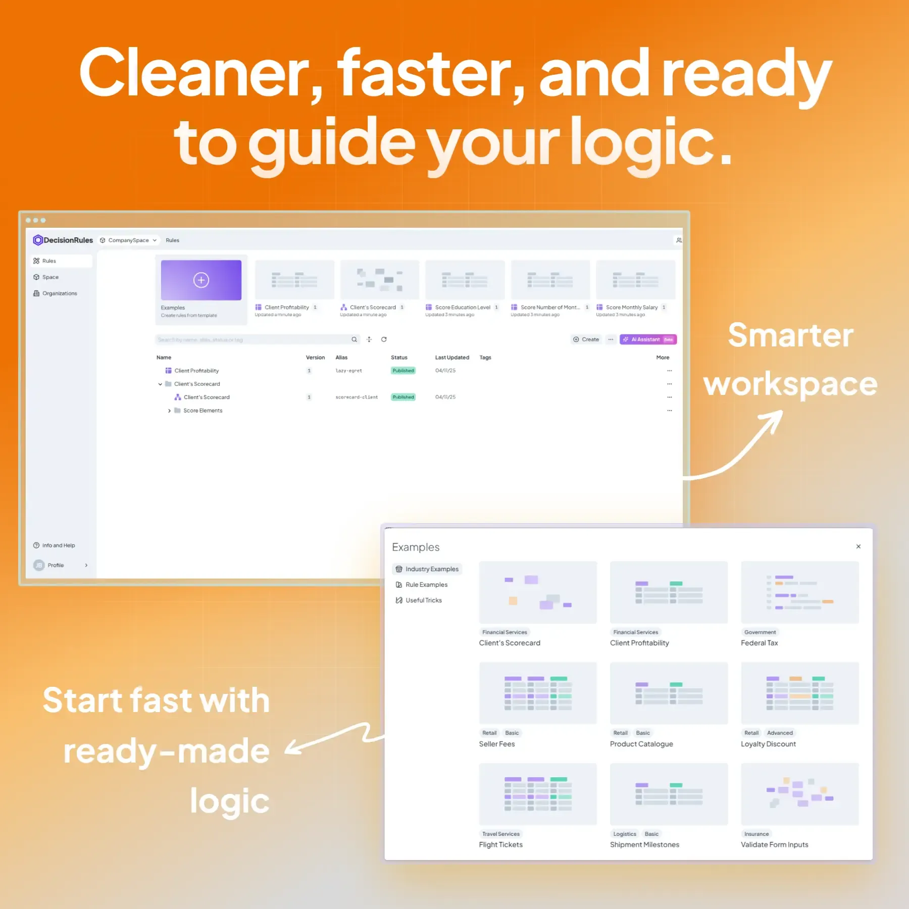
Main Page: Command Central
This is where you manage your rule assets and account settings. It’s streamlined to help you find what you need quickly.
Highlights:
-
A cleaner top panel showing space ownership and easy space switching
-
Left navigation with clear sections for Rules, Templates, Spaces, Organizations, Help, and Profile
-
An all-new Templates section to kickstart your logic with pre-built examples
-
An improved Rule List with more data at a glance and quick access to common actions
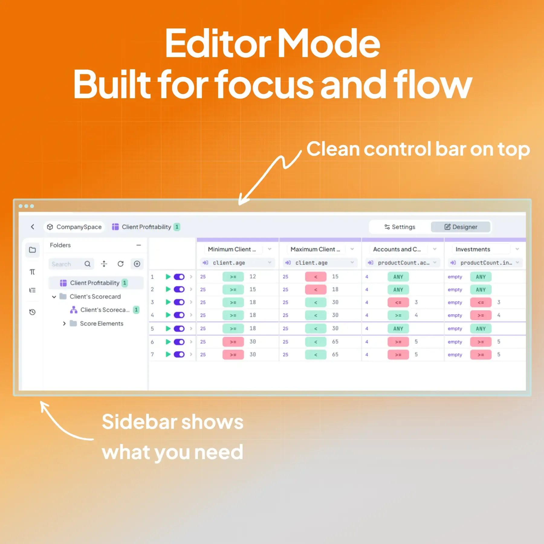
Editor Mode: Designed for Focus
When you open a rule, you’ll now enter a dedicated Editor Mode — a focused workspace where you can build and refine logic without distractions.
What’s new:
-
Refined top bar with clear rule versioning and editing actions
-
A side panel with context-aware tools based on the rule type (e.g. Variables, History, Dependencies)
-
Visual polish to tabs, buttons, and icons for better consistency
-
Quick access to integrations and improved control over your workspace
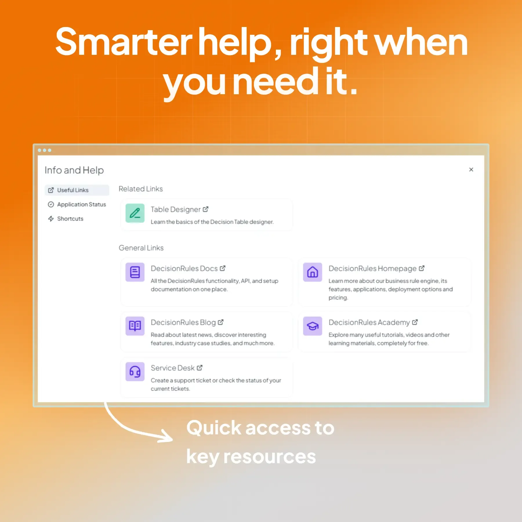
Help When You Need It
We’ve overhauled the Help Center experience too. The new Help modal is always accessible and context-aware, giving you relevant tips and links based on where you are in the app.
It includes:
-
Quick access to documentation, the academy, blog, and support
-
Live system status updates
-
Smarter shortcuts tied to your current activity
Updated Documentation to Match
Our documentation has been reorganized to reflect the new layout — so it’s easier to find what you’re looking for and stay aligned with how the app is structured.
Built with You in Mind
This redesign is based on real user feedback and best practices in UX. It’s the first step in a broader effort to improve the overall experience of using DecisionRules — whether you’re a solo builder or managing decision logic across a large organization.
We’ve kept what works, improved what didn’t, and set the stage for faster, more intuitive product updates in the future.
The new design is live now. Log in and take it for a spin.